Your school building is probably accessible. You probably have a ramp for people who can’t use the stairs so that they can still come inside. This same principle applies to your school website. People who can’t see or use a mouse will still need access to your school’s website. So you should ensure that your website – and its content – is accessible to them.
At Rally, our development team works diligently to ensure our websites are as accessible as possible. While a lot of accessibility is determined by your website provider, there are a handful of ways that you can ensure your website is accessible to everyone.

1. Provide Alt Text for Images
A picture is worth 1000 words! But if someone can’t see, you’ll have to describe the image on your website to them. You should be able to add an alternate text description for images on your site. If someone can’t see, they’ll have assistive software to help them read websites. When this software reads your websites to these users, it will use the alt text to describe the image. If you don’t provide any alt text, there won’t be any information for that person.
If you’re worried about forgetting to include ALT text, see if there’s a setting like Rally’s you can turn on to make it required.
When adding alt text, add a brief description of the image. Based on these two descriptions, which one provides you with a better visual?
- Having fun in class!
- A teacher helps two students create art in class.
Describe what’s happening in the image and include details on the important aspects of the image: A teacher helps two grade 1 students in art class. They sit at a kid’s table, which is covered in an array of colourful markers.
2. Remove Text from Images
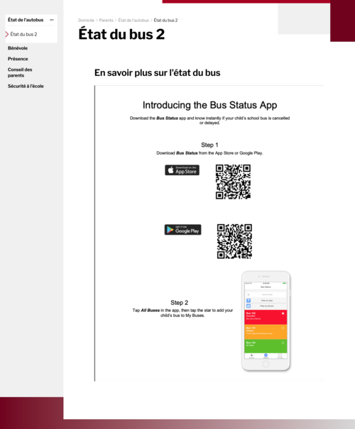
If someone can’t see an image, they’re not going to be able to read any text in that image. Neither will their accessibility tool. Text in images won’t be captured by translation tools either, so anyone who needs to access your website’s content in another language won’t be able to. There’s a reason websites have different places for you to put text and images. This is the most common accessibility issue we see with school and school division websites.
Instead of just scanning a document and adding it to your website as a PNG or JPG, take the time to reformat it into an accessible PDF or Word document and upload it to your website in an accessible format so everyone can use it. Don’t put important information in an image carousel: some people simply won’t be able to read it.
3. No Moving Images
Moving images cause accessibility issues, especially if there’s no way for the website visitor to pause or flip through the images themselves. People read at different speeds, so what might seem like a reasonable amount of time for one person might not be enough for another. Image carousels almost always contain important information – in the shape of text in images.
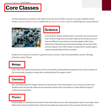
4. Use Headings and Titles
Page titles are really important for helping website visitors find the information they’re looking for. The page title is usually one of the first things people see on the page, so it should describe the content on the page so people know if they’re in the right place. How does it look in the menu? Can visitors quickly skim over the menu items to find what they’re looking for and know exactly what will be on each page? Keeping page titles accurate provides stability and consistency for users, creating a better experience for them online. Lastly, your page title should be visible in the window title bar. People should be able to see at a glance what pages they have open in different tabs in a browser.
Accurate page titles will help anyone with short-term memory or reading challenges navigate through your website. It’ll also improve user experience by helping people quickly identify if the page has the information they want.
5. Use Proper Text Styles
When adding content to your website, you should have access to some kind of text formatting tool. To help organize your content, it’s a good idea to use text styles. In addition to a title, use headings (Heading 1) and subheadings (Heading 2 or Heading 3) to make the relationship between your content clear. Rather than just bolding text and making it bigger to create a title or header, choose the style from your text editor. This tells the website that this text is a title or header and it will be reflected in your website’s code. It’s easy to do while you’re adding content, and it makes a big difference on your website.
For one, it will keep all your titles and different headings consistent across your website. This will make it easier for visitors to quickly identify top-level and secondary content while keeping your website clean. Secondly, it will make your website more accessible because the HTML code now knows the hierarchy of your content and can share that information with accessibility software. If you just change how the text looks without changing the underlying style, the accessibility tool won’t know that it’s a header and users could miss important information.
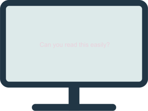
6. Use Good Colour Contrast
As a good rule of thumb, ensure that your content is easy to read by using proper colour contrast. Your web designer should take care of contrast for you. The best websites have well defined styles. Don’t just go in and change text colours and fonts - those were probably selected for a reason.
Your website is not a word document: it should have a professional, clean, and consistent look throughout. If the text is a similar colour to the website’s background, it will be harder for many visitors to read.
Use colours that highly contrast each other to ensure that visitors can actually read your text. This doesn’t mean all of your text needs to be bright red against a black background. Quite the opposite: you’ll actually want to avoid those bright colours for text, as it’s really hard on people with reading disabilities.
Keeping your website accessible to everyone doesn’t have to be a lot of work. There’s a few small habits you can build to ensure that your website is reaching as many people in your community as possible:
- Provide Alt text for images
- Remove text from images
- No moving images
- Use headings and titles
- Use proper styles
- Use good colour contrast
The W3 website provides more information about the WCAG Guidelines and more simple checks you can perform on your website.